Why Decorating Myths Persist
Home decorating advice travels fast - through magazines, social media, and well-meaning relatives. The problem is that much of it started as a general principle and hardened into absolute rule over time. When a guideline gets repeated enough, it starts to feel like fact, even when exceptions are common and the original context has been forgotten.
Understanding which "rules" hold up and which ones don't gives you more creative freedom and helps you avoid costly mistakes. This article examines some of the most persistent decorating myths and explains what designers actually consider when making these decisions. For a broader vocabulary to support your thinking, the plain-language design reference is a useful companion.
Myth
Dark colors make a room feel smaller and should be avoided in compact spaces.
Fact
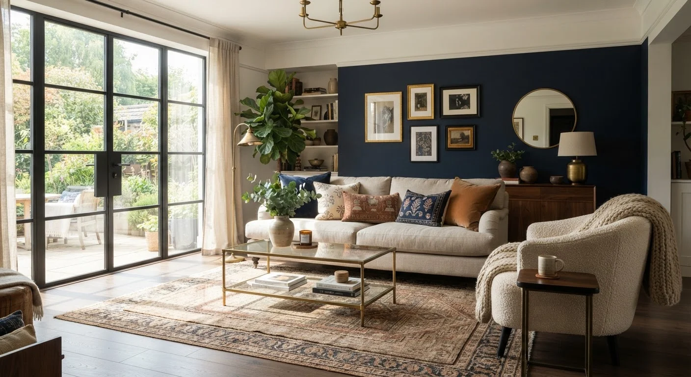
Dark colors can create a sense of depth and enclosure that makes a room feel purposeful and cozy rather than cramped.
This myth conflates two different things: brightness and perceived space. Light colors reflect more light, which can help a room feel airy - but that doesn't automatically make dark colors the wrong choice. Deep tones like navy, forest green, or charcoal can visually recede walls, adding a sense of depth. They also create contrast that makes architectural features and furnishings stand out.
Plenty of small rooms - a powder room, a reading nook, a bedroom - actually benefit from a dark, enveloping palette. The real variables are natural light availability, ceiling height, and what atmosphere you want the room to project. For more on navigating compact spaces, see small-space decorating strategies.
Myth
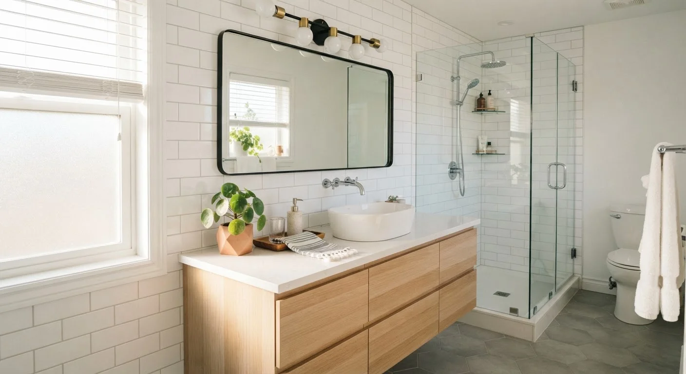
You must match all your metals - mixed finishes look messy and unintentional.
Fact
Intentionally mixing two or three metal finishes adds visual depth and is a widely used technique in contemporary interior design.
The idea that every metal in a room must match likely evolved from a preference for uniformity, but design has long moved past it. A room with exclusively matching metals can actually feel sterile or overly coordinated. The key distinction is between mixing metals deliberately and mixing them at random.
A practical approach: choose a dominant metal for the most visible fixtures, then introduce one or two accent metals in smaller details like cabinet hardware, lamp bases, or decorative objects. Finishes with similar undertones - warm brass with warm copper, cool chrome with cool matte black - tend to work well together. Finishes that contrast sharply can also work, but require more careful placement.
Myth
Small rooms need small furniture - large pieces will overwhelm the space.
Fact
Furniture scaled appropriately to how the room is used often serves better than a collection of small pieces that create clutter and visual noise.
Filling a small room with uniformly small furniture can actually make it feel more cramped, not less. Many small pieces create visual busyness - lots of legs, lots of edges, lots of competing shapes. A single well-chosen sofa or dining table scaled to the room's footprint can anchor the space more effectively.
What matters most is proportion relative to the room and to adjacent pieces, not absolute size. One substantial bookcase along a wall reads as a single statement. Six small shelving units scattered around the same room fragment the eye and make the space feel chaotic. Understanding visual weight is essential to making this call well.
Myth
All wood tones in a room should match to look cohesive.
Fact
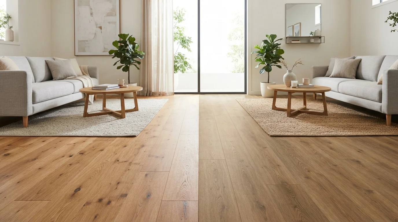
Mixing wood tones thoughtfully - varying undertone, grain, and finish - adds warmth and visual interest that matching can flatten.
Perfect wood-tone matching was a practical byproduct of buying furniture as matching sets, which was once the standard approach. Today, layering different wood species and finishes is considered a mark of a more considered, lived-in look. A light oak dining table alongside walnut dining chairs, balanced by a painted sideboard, reads as layered rather than inconsistent.
The guidelines that help: vary undertones with intention (mixing warm honey oak with cool grey-washed ash takes more care than mixing warm tones together), keep proportions balanced so no single finish dominates unexpectedly, and use textiles and soft furnishings as a unifying thread. Soft furnishings are especially effective at pulling disparate wood tones into a cohesive feel.
Myth
Every wall needs something on it - blank walls look unfinished or bare.
Fact
Negative space on walls is an intentional design tool that gives the eye somewhere to rest and makes displayed pieces more impactful.
The impulse to fill every wall often comes from anxiety about a space feeling unfinished. But visual clutter is a real concern, and a room dense with art and objects can feel overwhelming rather than curated. Interior designers routinely leave stretches of wall bare to give a featured piece room to breathe, or to balance a busy section of the room.
Negative space - blank wall area - is not empty space; it's an active compositional element that shapes how the eye moves through a room. A single large print on an otherwise bare wall commands attention in a way that the same print surrounded by eight smaller pieces cannot. If your kitchen still feels busy despite regular edits, the guide to kitchen clutter after decorating covers how the same principle applies in more functional spaces.
Putting the Myths in Practice
Correcting a myth is only helpful if you know how to apply the correction. A few practical principles make it easier to move from "I know the rule is wrong" to "here's what I'll do instead."
~60%
Homeowners who repaint within 2 years of moving in
Paint is one of the most commonly revisited decisions, often because initial color choices were guided by fear of "getting it wrong" rather than intentional preference.
3
Metal finishes: recommended maximum per room
Interior design practitioners commonly suggest limiting mixed metals to three finishes per space to maintain visual cohesion without monotony.
Let the room's purpose guide color choices. A bedroom benefits from different psychological cues than a home office. Rather than defaulting to light paint because a room is small, consider what mood supports how you use the space. Our guide to warm and cool paint palettes walks through how lighting and room size both factor into that decision.
Anchor your metal mixing with a dominant finish. Choosing one metal to appear most frequently - say, brushed brass on light fixtures and cabinet pulls - and using a second or third finish as accents keeps the look cohesive. For kitchen-specific guidance, see how to mix metals in kitchen decor.
Think in terms of visual weight, not just size. A single large sofa isn't automatically overwhelming in a smaller room if the wall color, rug scale, and lighting are balanced around it. The visual weight principle is the underlying concept that ties these decisions together.
Don't Let Trend Content Replace Your Own Judgment
Social media feeds are optimized for engagement, not necessarily for accuracy or applicability to your specific home. A decorating approach that photographs beautifully in a staged, professionally lit room may not translate to your layout, natural light conditions, or budget. Use trend content as inspiration and a starting point - not as a definitive instruction set.
When you're ready to put these ideas to work from scratch, the first-home decorating guide offers a grounded starting point.