What Visual Weight Actually Means
Walk into a room and something feels off - maybe it's lopsided, unsettled, or just a little too busy on one side. You probably don't think to yourself, the visual weight is unbalanced, but that's almost certainly what's happening.
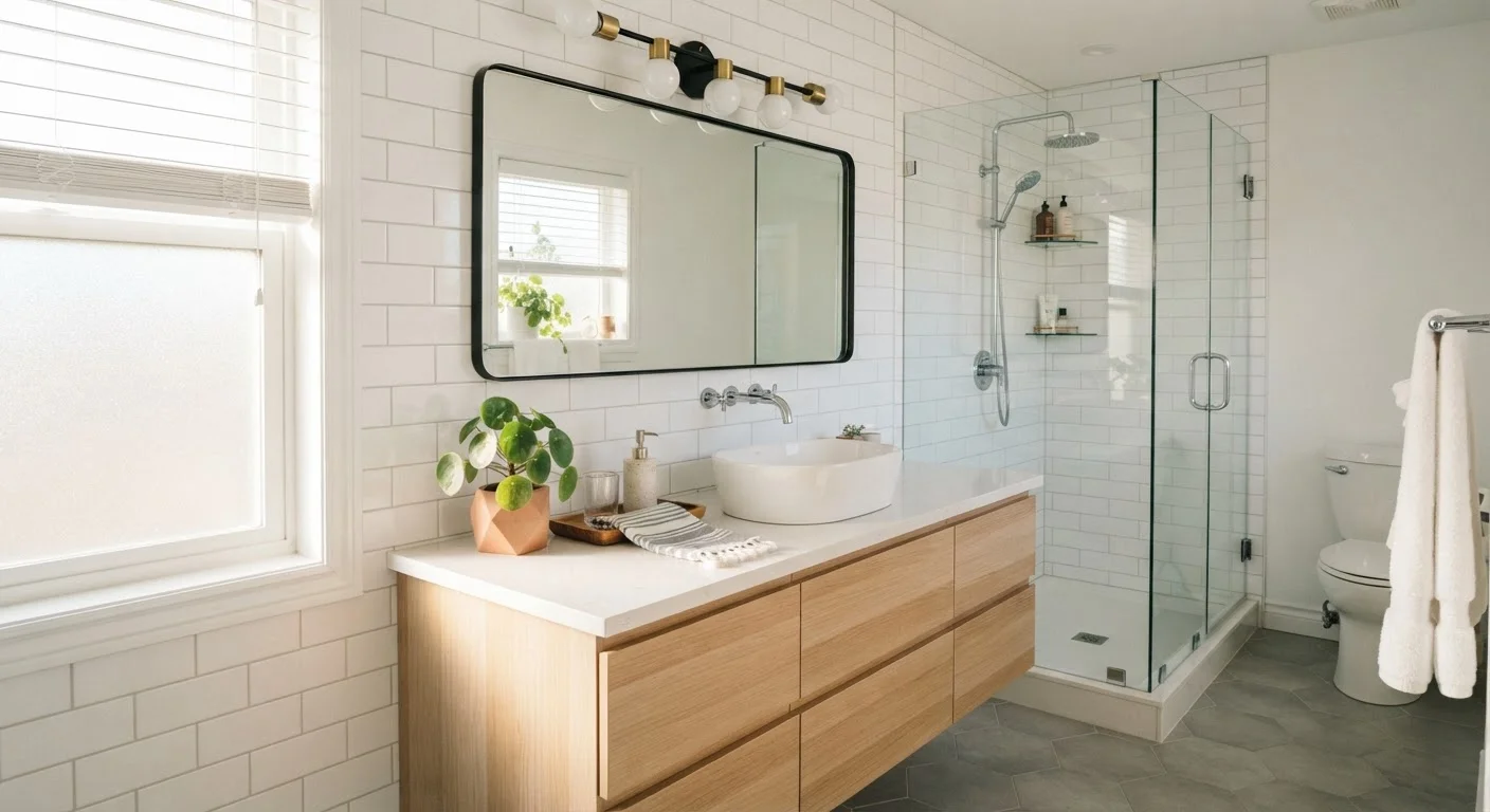
Visual weight is the perceived heaviness of objects in a space based on how the eye processes them. It has nothing to do with how much something weighs on a scale. A large pale sofa may feel lighter than a small but intensely patterned armchair. A dark wood console can anchor a wall more firmly than a white bookcase twice its size.
Four key factors determine visual weight:
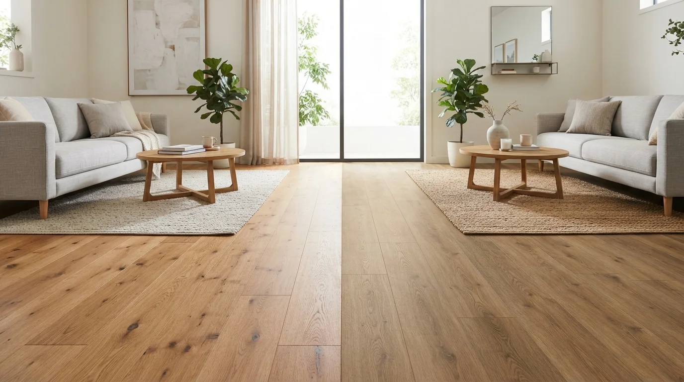
- Color and value: Darker tones carry more weight than lighter ones. A black coffee table feels grounding; a glass one nearly disappears.
- Size and scale: Larger objects naturally draw more visual attention, though scale relative to the room matters as much as absolute size.
- Texture and pattern: Rough, layered, or highly detailed surfaces attract and hold the eye, adding perceived mass.
- Shape: Angular, geometric forms feel denser and more assertive than soft, curved silhouettes.
Once you understand these factors, you start to see rooms differently - not as collections of furniture, but as arrangements of perceived mass that either settle into harmony or pull against each other.
Visual Weight Is Not the Same as Visual Clutter
A room with high visual weight isn't necessarily busy or overfull. A single large, dark, well-placed cabinet can anchor an entire wall with quiet confidence. The problem isn't the weight itself - it's when that weight is concentrated in one area rather than spread across the room. Clutter, by contrast, is typically the result of too many small items competing for attention without a clear sense of organization or hierarchy.
Why Balance Matters - and What It Really Looks Like
Balance in a room doesn't mean symmetry. Many people assume that a balanced space requires matching lamps on either side of a sofa or identical nightstands flanking a bed - and while that approach does work, it's just one version of balance.
Interior designers generally recognize three types:
- Symmetrical balance: Mirror-image arrangements on either side of a central axis. Formal, classic, and immediately readable. A fireplace flanked by identical armchairs is a typical example.
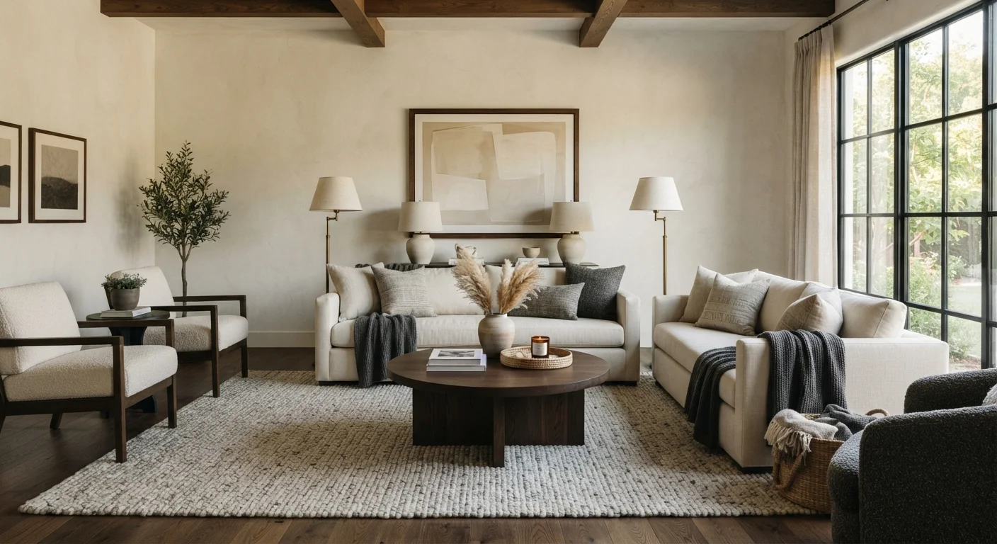
- Asymmetrical balance: Different objects that carry equivalent visual weight. A large sectional on one side might be balanced by a tall bookcase, a floor plant, and a floor lamp grouped on the other. The combined visual weight equalizes.
- Radial balance: Elements arranged around a central focal point, like chairs around a round dining table. Less common in residential spaces but creates a strong sense of structure.
Most liveable rooms use asymmetrical balance - it feels natural and relaxed without looking accidental. The key is developing an eye for when one side of a space is pulling too much visual attention. See our guide to focal points for how to anchor that balance around a deliberate visual center.
“Balance is not something you find. It's something you create - and in interior design, you create it by teaching your eye to see weight before it sees style.”
— Paraphrased from common interior design pedagogy, Widely cited principle in professional interior design education
How to Identify and Fix Imbalance in Your Own Rooms
The fastest way to diagnose visual imbalance is to stand in a doorway and squint at the room. Squinting blurs detail and makes the distribution of dark, heavy shapes versus light, open space immediately obvious. If one area looks denser or darker, that's where the visual weight is pooling.
Common imbalances and how to address them:
- Too heavy on one side: Move a large piece of artwork or a floor lamp to the lighter side. Alternatively, group several smaller items - a plant, a stack of books, a textured throw - to build weight incrementally.
- Everything feels too light and airy: Add a dark anchor, such as a richly toned rug, a darker throw pillow grouping, or a substantial piece of wall art at a low hang height. Strategic plant placement can also add grounded, organic weight to bare corners.
- The room feels top-heavy: This happens when artwork or shelving is hung too high with little visual weight below. Lower your hangings, or add floor-level interest through a layered rug or low furniture arrangement.
- Gallery walls that read as chaotic: Uneven frame sizes and inconsistent spacing create visual noise. For a more composed look, see how to avoid cluttered gallery wall arrangements.
Use the Squint Test Before Rearranging
Before moving furniture or buying anything new, stand at the room's entrance and squint until the details blur. The dark masses and light voids you see are your visual weight map. This low-tech technique takes less than a minute and reveals imbalances that are hard to see with a sharp eye trained on individual pieces.
Visual weight is also a useful lens for small or compact spaces. When items are scaled too large for the room, the space feels overwhelmed - not balanced. Small-space decorating strategies often rely directly on managing visual weight through furniture scale and color choices.
60-30-10
Color ratio rule used by designers
Interior designers commonly apply a 60-30-10 ratio (dominant, secondary, accent color) as a framework for distributing visual interest and weight across a room.
~57-60 in
Recommended art hanging height
Design guidelines widely recommend hanging artwork so its center sits at approximately 57 to 60 inches from the floor - roughly eye level - to keep visual weight in the mid-zone of the room and avoid a top-heavy feel.