Why Gallery Walls Go Wrong
A gallery wall, when done well, is one of the most personalized and visually rewarding things you can add to a home. When done poorly, it reads as clutter on a wall - and unlike a messy countertop, you can't just clear it off in five minutes. The difference between the two usually comes down to a handful of planning decisions made - or skipped - before a single nail goes in.
Gallery walls fail most often not because the art is wrong, but because the system around the art is missing. No consistent spacing. No unifying thread. No relationship to the scale of the wall or the room around it. These are fixable problems, and recognizing them is the first step. This same principle - that visual clutter usually has a structural cause - applies across rooms, as explored in why kitchens feel cluttered even after decorating.
Hanging frames at inconsistent heights and without a clear visual anchor.
Why it happens: People hang pieces one at a time, eyeballing each placement independently instead of treating the collection as a single unit.
Using frames in too many conflicting colors, materials, and sizes with no unifying element.
Why it happens: Collectors add frames over time, picking favorites without considering the overall system, which results in a mix that feels accidental rather than curated.
Spacing frames too far apart, creating visual disconnection between pieces.
Why it happens: Homeowners worry about overcrowding and err too far in the opposite direction, leaving gaps that break the arrangement into isolated clusters.
Including too many pieces with competing focal points - bold patterns, clashing colors, and varied subject matter all at once.
Why it happens: Each piece feels meaningful individually, so it's hard to edit the collection down, leading to an arrangement where nothing stands out because everything is fighting for attention.
Hanging the gallery on a wall that competes with existing busy elements nearby.
Why it happens: A wall next to a patterned sofa, a large bookcase, or a window with ornate treatments may already have significant visual weight - adding a dense gallery amplifies the clutter.
The Principles That Separate Polished From Chaotic
Once you understand the common mistakes, the underlying principles become clear. Successful gallery walls share a few structural characteristics regardless of style or budget.
2-3 in
Ideal gap between gallery wall frames
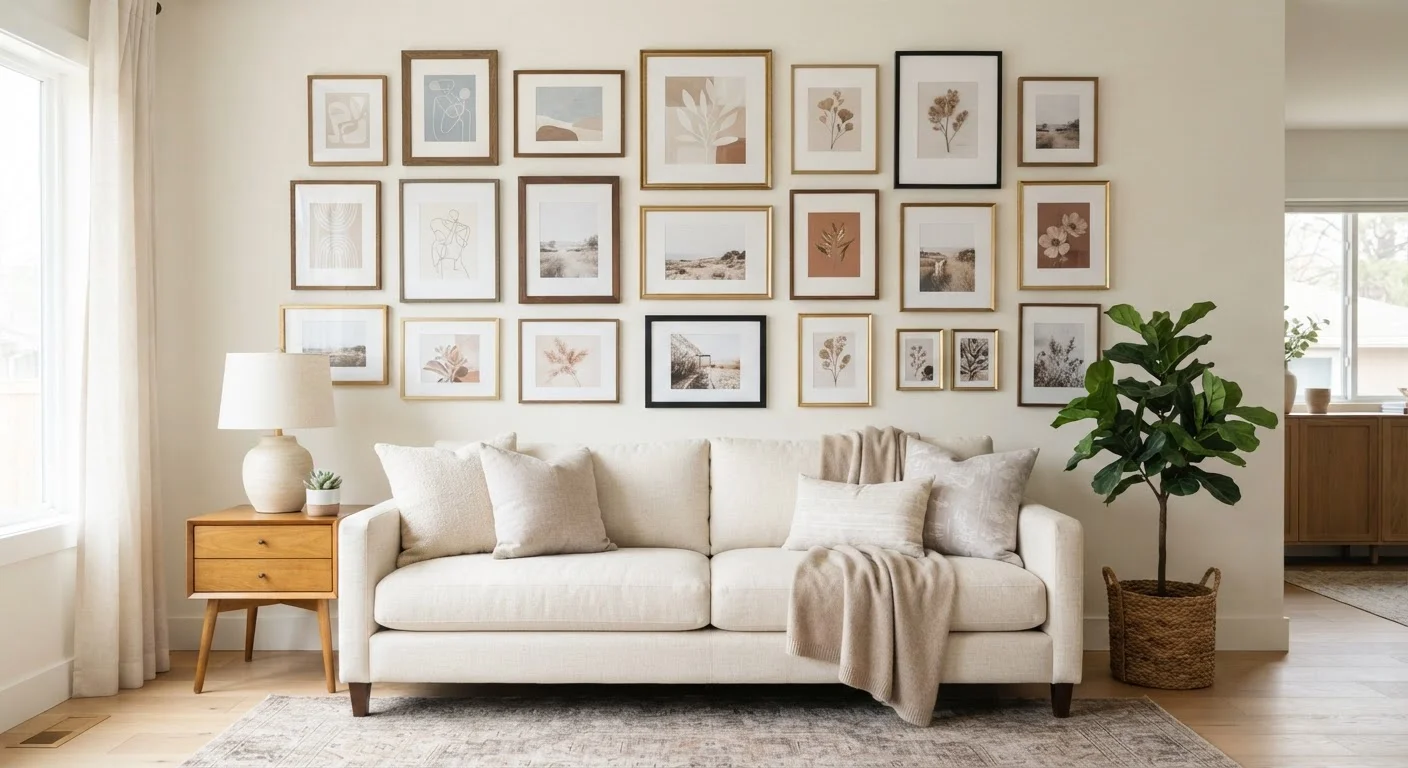
Interior design guides consistently recommend 2 to 3 inches of even spacing between frames for a curated, intentional appearance.
60-75%
Wall space a gallery arrangement should fill
Design professionals generally suggest a gallery grouping occupy 60-75% of its anchor wall to feel proportional rather than sparse or overwhelming.
Restraint in variety: Mixing elements is encouraged - but mix only one or two variables at a time. Vary frame size but unify finish. Vary subject matter but unify color palette. Trying to vary everything simultaneously is what produces the chaotic result most people are trying to avoid.
Deliberate negative space: The wall between your frames is part of the design. Too little space and the arrangement feels oppressive; too much and it fragments. That 2-to-3-inch rule exists because it creates breathing room without breaking visual cohesion.
Relation to the room: A gallery wall doesn't exist in isolation. It should complement - not compete with - surrounding furniture, lighting, and decor. For a broader framework on how each room's elements should work together, a room-by-room decorating checklist can help you evaluate the full picture. Similarly, if you're working with a smaller space, the strategies in small-space decorating can help you decide whether a gallery wall suits the room at all.
Plan Before You Hang Anything
Hammering nails directly into your wall without a tested layout is one of the most preventable gallery wall mistakes. Trace each frame on kraft paper, cut out the templates, and tape them to the wall first. This lets you adjust spacing, composition, and balance before making a single hole - saving both your walls and your patience.
Don't Ignore Wall Scale
A collection of small frames on a large, open wall will read as sparse and underwhelming rather than intentional. Before buying or hanging anything, measure your wall and consider the total footprint your arrangement needs to fill. As a general rule, your gallery grouping should occupy roughly 60-75% of the wall space it anchors, similar to how a rug should relate to furniture groupings.
Gallery walls also share visual logic with other display choices - open shelving, for instance, faces similar curation challenges. If you're considering both, the trade-offs of open shelving is worth reading alongside this guide.