What Separates Warm Tones from Cool Tones
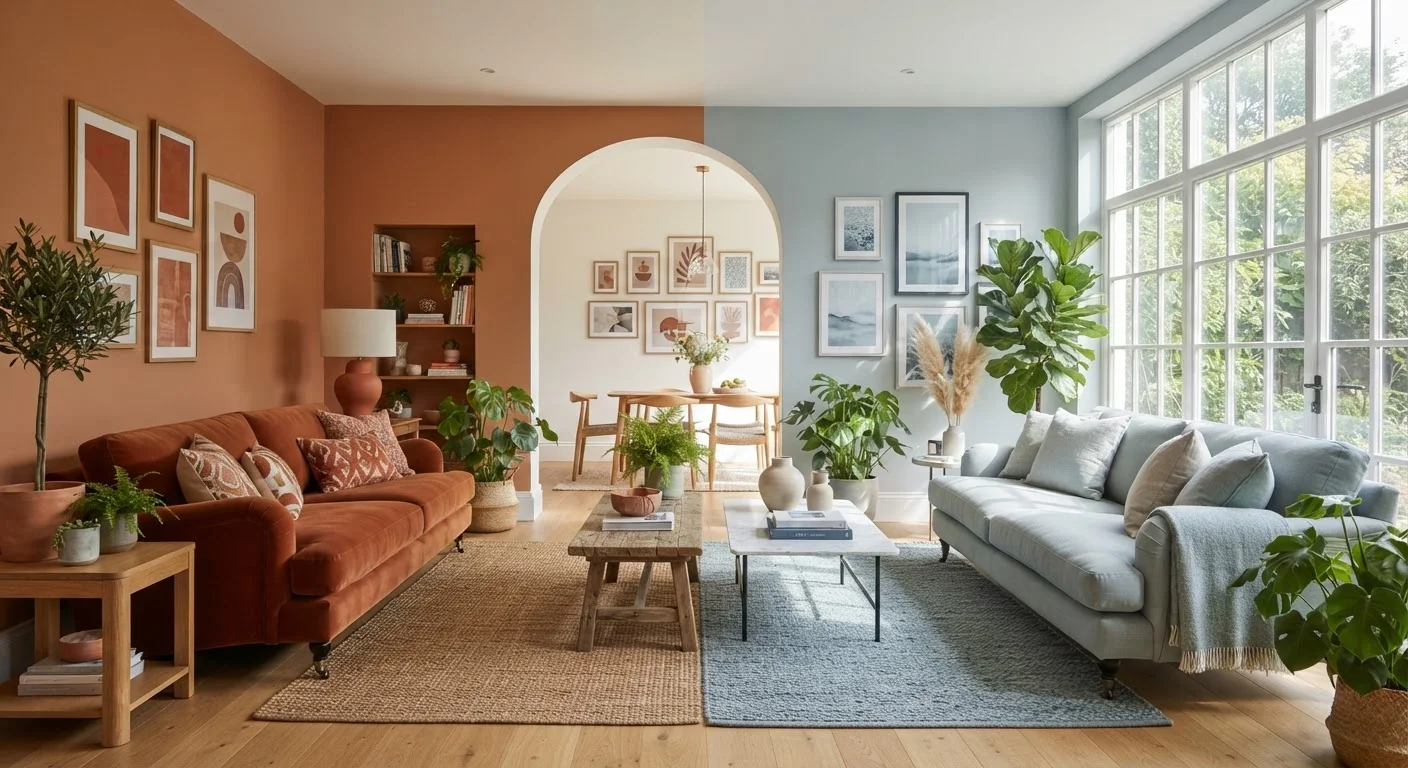
On the color wheel, warm tones sit in the red, orange, and yellow family - including earthy neutrals like terracotta, camel, warm beige, and cream. Cool tones occupy the blue, green, and violet range, extending into cool greys, crisp whites, and sage greens.
The trickiest category is neutrals - whites, beiges, and greys - because they each carry an underlying warm or cool bias. A white with a yellow or pink undertone reads warm; one with a blue or green undertone reads cool. This is why two whites that look identical on a chip can look completely different once painted on a wall. Always test full sample patches in your actual room before purchasing full quantities.
| Criterion | Warm Tones | Cool Tones |
|---|---|---|
| Color families | Reds, oranges, yellows, earthy neutrals | Blues, greens, violets, cool greys |
| Perceived room size | Makes spaces feel smaller, cozier | Makes spaces feel larger, more open |
| Best light conditions | North-facing or low-light rooms | South-facing or bright, sun-filled rooms |
| Mood & atmosphere | Energizing, intimate, welcoming | Calming, restful, focused |
| Best room function | Living rooms, dining rooms, entryways | Bedrooms, bathrooms, home offices |
| Pairs well with | Wood tones, brass, tan upholstery | Chrome, painted white cabinetry, grey stone |
How Light Changes Everything
Paint color does not exist in isolation - it is filtered through light before it reaches your eye. The direction your room faces and the quality of light inside it will meaningfully shift how any color reads on the wall.
- South-facing rooms receive warm, bright light for most of the day, which intensifies warm tones and softens cool ones.
- North-facing rooms get indirect, cooler light that can make blues and greys feel flat or chilly. Warm tones typically counteract this effect.
- East-facing rooms are bright and warm in the morning, turning cooler in the afternoon - versatile rooms that suit both palettes.
- West-facing rooms are often shadowy in the morning and bathed in golden evening light, which flatters warm hues.
Artificial lighting adds another layer. Incandescent and warm LED bulbs amplify warm tones; daylight-balanced LEDs preserve cool tones more accurately. For a fuller picture of how to plan around your light sources, see how natural and artificial light serve different design functions.
~60%
Color perception influenced by lighting
Color scientists generally estimate that lighting conditions account for the majority of how a painted color reads in a finished room, though exact figures vary by study.
2-3 samples
Recommended wall patches before purchase
Interior design professionals routinely advise testing at least two to three large sample patches on different walls in the same room before buying full paint quantities.
Room Size, Function, and the Palette Decision
Warm and cool tones interact differently with perceived space. Warm colors visually advance - walls appear closer, which can make large, echoing rooms feel intimate and defined. Cool colors visually recede - walls seem to pull back, expanding the perceived footprint of a room. This makes cool tones a practical choice for smaller rooms where openness matters, though the common decorating myth that dark colors always shrink a room is more nuanced than that simple rule suggests.
Room function also matters. Spaces meant for socializing - living rooms, dining rooms, entryways - often benefit from the enveloping quality of warm tones. Spaces for rest, focus, or concentration - bedrooms, home offices - tend to work well with cool, quieter palettes. Kitchens, interestingly, can suit both: warm tones create appetite and energy, while cool tones feel clean and organized. For kitchen-specific palette thinking, see how color fits into a cohesive kitchen design.
Working with Your Existing Furniture and Finishes
The most practical filter for your palette decision is what's already in the room and cannot easily change: flooring, cabinetry, countertops, and large upholstered pieces. These fixed elements carry their own undertones, and clashing undertones between walls and furniture create a subtle visual tension that is hard to diagnose but easy to feel.
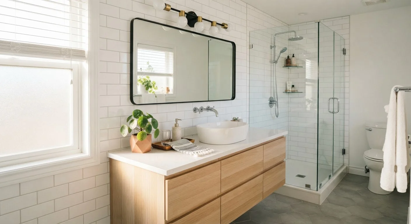
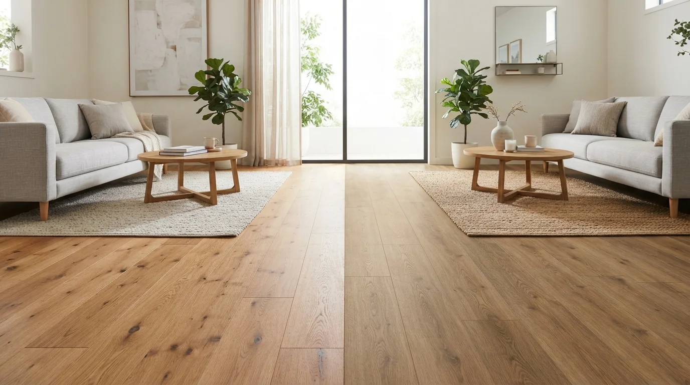
Honey oak, warm walnut, tan leather, and brass fixtures all point toward a warm palette. Cool slate, painted white cabinetry, chrome hardware, and grey upholstery are natural partners for cool-toned walls. When you have a mix - say, warm wood floors with a cool grey sofa - look for a neutral wall color that bridges the two. Warm greige (a blend of grey and beige) often does this effectively.
Paint finish also plays a role in how tones appear. Flat and matte finishes absorb light and can deepen both warm and cool tones, while gloss finishes reflect light and can make colors appear lighter and more saturated. Understanding the difference between matte, eggshell, satin, and gloss before you commit to a color is just as important as the color itself.
Don't Skip the Sample Patch Step
Paint swatches at a store are viewed under commercial lighting on white paper, which distorts how the color will look in your home. Always purchase sample pots and paint at least a 12-by-12-inch patch directly on the wall. Observe the patch at different times of day and under both natural and artificial light before making a final decision. This single step prevents the most common - and most expensive - paint regrets.