What 'Cohesive' Actually Means in Kitchen Design
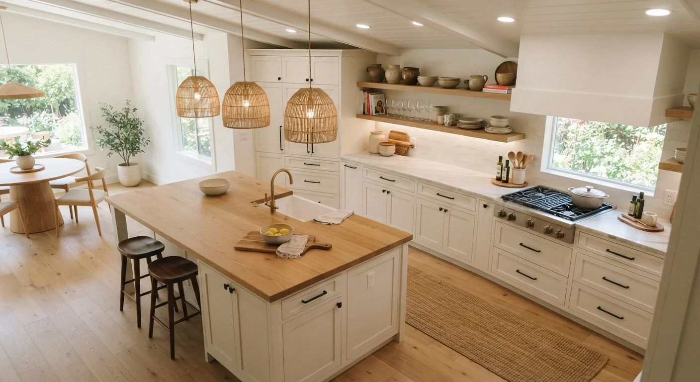
A cohesive kitchen isn't one where everything matches - it's one where everything belongs. When a kitchen feels unified, the eye moves smoothly from surface to surface without landing on anything that feels out of place. That sense of order comes from deliberately connecting several design elements: color, texture, lighting, and hardware.
Understanding how each element contributes - and how they interact - helps you make intentional choices rather than reactive ones. Whether you're starting fresh or refining what you already have, this reference guide breaks down the building blocks of a kitchen that looks and feels pulled together. For an overview of the broader styles that frame these choices, see our guide to kitchen design styles.
| Core design elements | Color, texture, lighting, hardware |
| Recommended palette size | 2-3 tones for most kitchens |
| Hardware consistency rule | Match finish family across all cabinetry and fixtures |
| Repeat rule for accents | Each accent element should appear at least twice |
| Lighting layers | Ambient, task, and accent |
| Common cohesion issue | Inconsistent hardware finishes |
The Four Core Elements and How They Work Together
Color
Color is typically the first thing a person notices when entering a kitchen. A cohesive color approach doesn't require a single hue throughout - it requires a consistent relationship between hues. A common framework is a dominant color (typically cabinetry or walls), a secondary color (countertops or backsplash), and an accent color (hardware or small appliances). Limiting your palette to two to three closely related tones reduces visual noise.
Texture
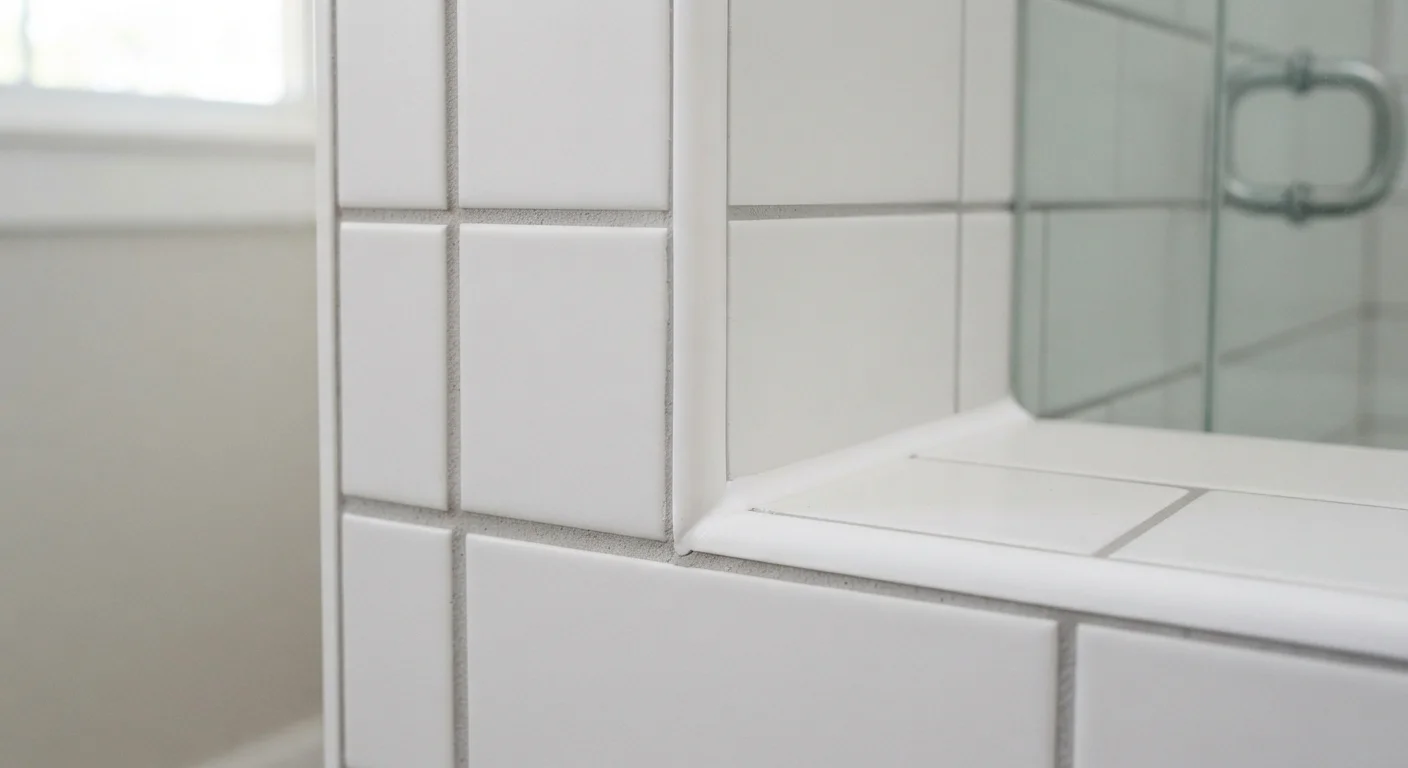
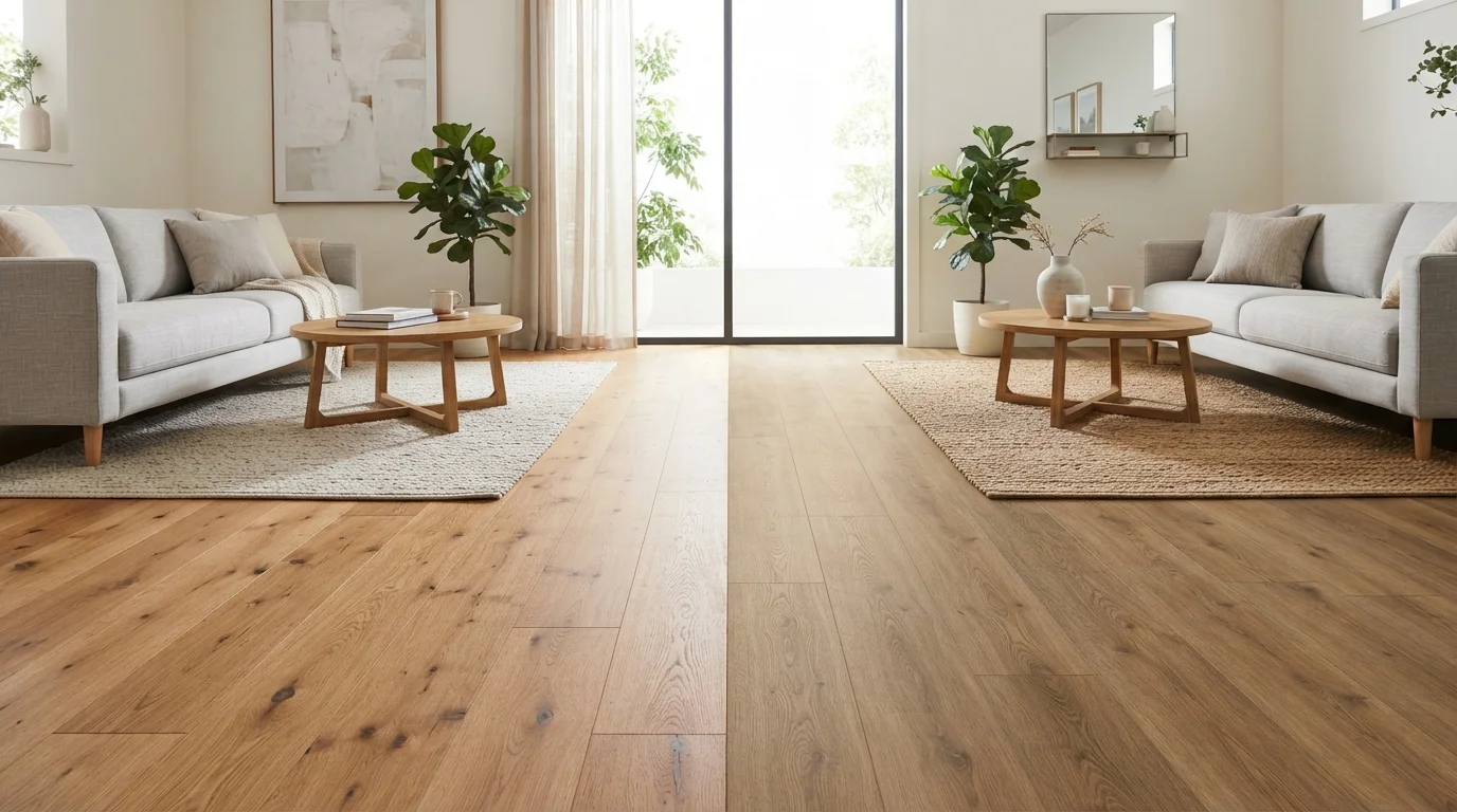
Texture adds depth without adding more color. A kitchen that uses only smooth, flat surfaces can feel sterile or flat even if the colors are coordinated. Pairing a matte cabinet finish with a textured tile backsplash or a honed stone countertop introduces contrast that feels intentional rather than accidental. Countertop materials each carry a distinct visual personality, so choosing one that complements your cabinet finish is a practical starting point.
Lighting
Lighting affects how every other element reads in the room. The same cabinet color can appear warm or cold depending on the light source above it. Layered lighting - ambient overhead light, task lighting under cabinets, and occasional accent lighting - lets a kitchen function well at different times of day while maintaining a consistent mood. Learn more in our in-depth look at how lighting transforms a kitchen.
Hardware
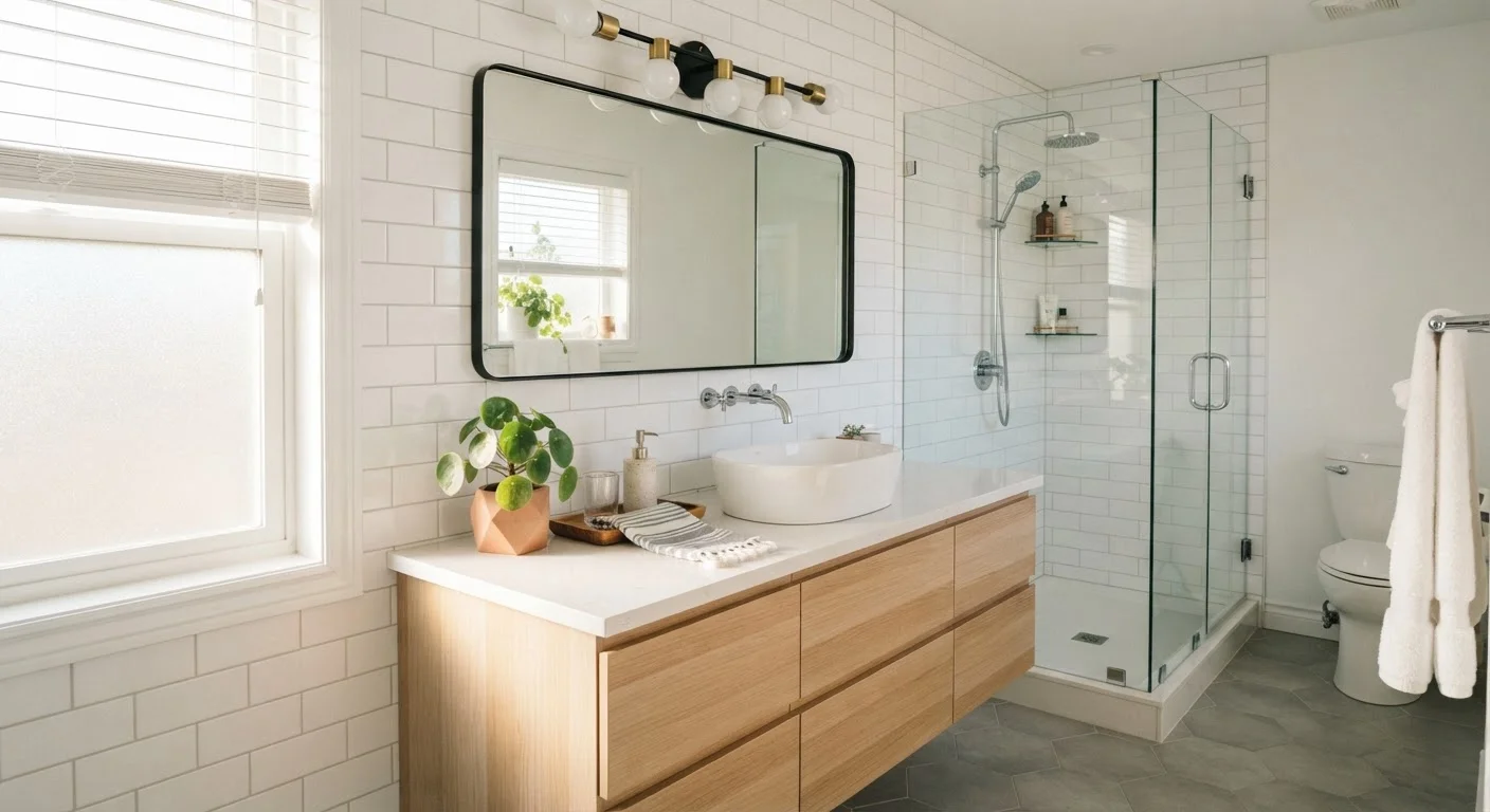
Cabinet pulls, knobs, and faucets are small in scale but significant in impact. Hardware functions as jewelry for a kitchen - it should share a finish family (brushed brass, matte black, satin nickel) used consistently across all cabinetry and fixtures. Mixing finishes without intention is one of the most common reasons a kitchen feels slightly off even after a full refresh. See why kitchens feel cluttered even after decorating for more on this pattern.
Color palette
The selected set of colors used throughout a room. In kitchen design, a restrained palette of two to three tones helps maintain visual unity.
Texture contrast
The intentional pairing of surfaces with different tactile and visual qualities, such as smooth cabinetry alongside a rough-hewn stone countertop, to add depth without adding color.
Layered lighting
A lighting strategy that combines multiple types of light sources - ambient, task, and accent - to serve both functional and atmospheric needs in the same space.
Hardware finish family
A group of metal finishes that share a common tone or undertone, such as matte black or brushed brass. Using a consistent finish family across all hardware ties a kitchen together visually.
Dominant color
The primary hue that covers the largest surface area in a room, most commonly cabinetry or walls. It establishes the overall tone of the space.
Accent element
A smaller-scale design feature - such as hardware, open shelving, or a backsplash tile - introduced to add visual interest. Repeating an accent at least twice signals intentionality.
Practical Ways to Check for Cohesion
Before committing to any change, it helps to audit what's already in place. A few reliable methods:
- The squint test: Step back and squint at the kitchen. If one surface jumps forward visually, it may be too dominant or contrasting with its neighbors.
- The swatch exercise: Collect physical samples of your major materials and lay them side by side in your actual kitchen light. Colors that look matched in a store may read differently at home.
- The repeat rule: Each accent element - a warm wood tone, a particular metal finish - should appear at least twice in the room so it reads as deliberate, not accidental.
If you're planning a refresh rather than a full renovation, our pre-redecorating checklist walks through the verification steps worth taking before any commitment. First-time homeowners will also find grounding guidance in our kitchen decoration primer.
This article provides general home décor information for educational purposes. Consult a qualified interior design professional for advice tailored to your specific space, budget, or structural situation.